We’re calling it: Yellow is the new Black. The color forecast in fashion has us mellow for yellow, as ‘greenery’ always withers.
I
The Pantone Color Institute color forecast aptly described the consumer and lifestyle trend towards 2017 as a main source evoking new lines of inspiration and design for this year’s spring collections. ‘Greenery’, the Color of the Year according to the reputable institution, is a shade of green, born from foliage, that hopes to attune design back into nature.
Pantone justifies its choice by tracing a consumer’s curve in which the globalized society fights for sustainability through the reactivation of the lost connection with the earth and the great outdoors. If 2016 presented us rose quartz and serenity blue as the necessity of the masses to look inward, turning their back to the alienation produced by a fast paced urban lifestyle; 2017 proposes to revitalize the design experience in a direction towards a concept of invigoration, refreshment and the organic.
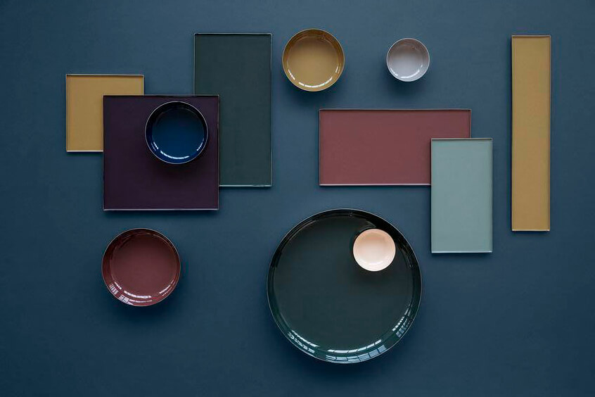
The Color Report dictates for spring that the vivacious green reaches a climax during the warm season, fair enough, since it belongs to a vegetable palette. It is in such palette in which we find a second shade in a leading role regarding color consumption: yellow. In its ‘primrose’ variation we find it as a soft and floral tone for spring that will become vital to interiors, floral design, glassware and accessories, but how does this color pretend to steal the spotlight? First and foremost, because it shares its soul with the ‘greenery’ green. Despite being a lively, grassy green, the color of the year is clearly a member of the green-yellow palette, and it is here in which the trend decants into the subtle color of a paled sun, or of countless flowers, the sweet shade of honey and amber.
A nature inspired yellow has been propitiated as a trend that like green leaves, fades during the autumn months, both coherent with their natural design; in the case of yellow, it mutates into a ‘mustard’ shade, particularly true in regard to fashion design, luxury goods resuscitate the love between the leather colored in camel, chocolate and walnut shades of brown, with the substantial shade of mustard. In the case of green, it morphs into an empty variant of brightness but still reminiscent to leaves.
An advocate for the case on chromatic leadership in fashion is the 74th Golden Globe Awards’ red carpet, showcasing a wide ensemble of the future of color, with remarkable galas of yellow being worn. We saw it daring in acid tones, shining in satin and silk, or under the power of alchemy, turned in old, yellow, rusty textured or polished shades of gold. As carried by some of the glamorous attendants: Emily Ratajkowski, concurrently, sported a satined-yellow dress with a mustard belt and a glittery silver strap dividing the joyfully colored fabric. The award-winning Sarah Paulson appeared with a pastel, almost neon yellow subtly winding under a predominant silver finishing, and in pure pastel was Reese Whiterspoon, with a yellow-gold shining charm, while Kerry Washington also wore it in a pastel tone courtesy of a complex floral embroidered pattern with a metallic finishing, switching Paulson’s palette, with yellow as the primary color and silver as second. Effortlessly channeling Jackie Kennedy, Natalie Portman wore a Prada one-piece gown in a fizzy canary yellow that infused life into her pregnant look with a textured that evoked, almost invisibly, a hint of lemon green.
II
Although being touted as predictable in the spring summer season, the pastel yellow palette is already extending its reach from the very first days of the year, by being presented and predicted through design trends as seen in the latest Pre Fall 2017 runways, both in menswear and womenswear. We found an acid yellow in a statement sweatshirt and in a basic long-sleeved tee with a turtle neck, both from Christopher Shannon, it also inhabited the entirety of a coat and a ruffled bizarre appliqué in Nina Ricci. On neon, Christopher Raeburn patches it as squares and it also shines though small additions in his accessories, while Vivienne Westwood introduced several pieces of voluminous falling fabrics, close fitted at times, in a mustard yellow and in a bronzed shade of gold.
In the MEN’s collection, the runway that stood out because of its excesses, with proposals as odd as a rocket-shaped coat covering the model from head to toe, we also saw the color in the most tamed segment of the catwalk, a beautiful bright yellow, in three full-looks, all three in the same shade, present in all the pieces populating the look. Other designers, like Emilio Pucci, were keen to include the shade, even though spring is long gone, be it though a highlight of color or in beautiful capes, dresses and even socks.
From the initial days of the new year, international-sized events as the Pre Fall 2017 Collections, the Menswear Collections for Fall Winter 2017-2018 and the first red carpets, drenched in Parisian Haute Couture and luxurious pieces from renown designers, all coquettishly wink at use of yellow. If the color has been, along orange, widely rejected in favor of feminine pinks and lustful shades of red (regarding the use of warm colors in couture), it now seems that the feeling of disenchantment present in the global community, due to the current political and social scenario, has taken its toll. From psychology comes taste, and 2017 has decided that, at least in terms of attire, Pantone was right when it comes to a living color palette that feeds off landscapes with baby blue skies, blossoming pinks, and obviously yellow and greens from organic origin.
The fashion world is beyond pressured, even challenged, by the preferences of the key audiences to include an eco-friendly aura to its products, especially in the last half decade; but strangely this trend doesn’t go hand in hand with the use of the predictable green as a symbol of ecology, no, design’s color palette will cease to color itself in vibrant greenery when the fall season has casted its spell over the world and leaves us with a reigning shade of yellow. As a king coming to life springing from pastel to neon, it is only a matter of time until we know if the upcoming Resort and Fall Winter 2017-2018 collections finally dethrone Pantone’s reigning green to crown a king of brighter colors.
Ivan Reverie, with images from ©Getty and ©cokacoka